A Complete Waste of Data
What is the U.S. Unemployment Rate?
How long do Europeans live?
What is the poverty level in our country?
The typical answers to all these questions are almost completely useless because the answer is almost always given as a scalar number. A scalar number is a single piece of information that represents a quantity or value.
For instance, the U.S. Unemployment rate right now is around 4%. But the employment situation in America is extremely complex. It varies by region, by race, cyclically by time of year, by age, and even from neighborhood to neighborhood. On top of that, this 4% number is built on a number of assumptions and proxy calculations, rather than simply just counting the number of people that want a job but cannot find it (because that would be extremely difficult).
Saying that the U.S. Unemployment Rate is 4% is like saying that the gravity in our solar system is 0.28. It gives you almost zero understanding of what is actually going on in the Solar System. Sure, that might be approximately correct; but it tells you almost nothing about the important gravity fields of the Sun and Jupiter and Earth. Instead, the gravity field of the solar system is described as a whole array of numbers tied to location…a field of gravitational measurements:

The best way to describe the gravity data of the solar system isn’t one number, not a scalar. It is a field. A field of data is numbers laid out across one or more dimension, with (likely) differing numbers at each point.
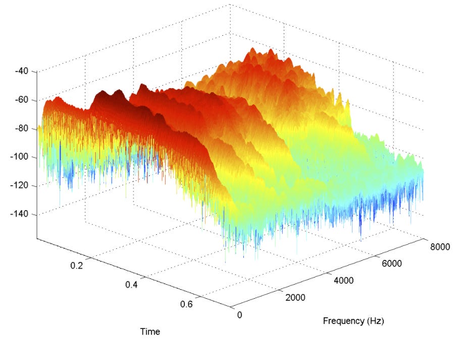
For instance, we could just say, with a scalar, that the average loudness of a motorcycle engine is 83 decibels. But if we graph that engine sound verses two dimensions, frequency and time, and graph the sound loudness at each frequency and time, we can see much more detail:

People can analyze this data to not just say that the motorcycle is loud, but also to say that it’s a Yamaha and not a Harley. Experienced users can even tell you which Yamaha model it is. World class motorcycle mechanics could sense from this data that it needs an oil change, the muffler is loose, or even that a spark plug is misfiring. They could never have learned any of that if you only told them the scalar data that the motorcycle is at 83 decibels of loudness.
A lot of companies are making big strides in Big Data by recording and parsing out this rich information, playing detective to save people money by doing real time monitoring of large pieces of equipment at power plants, bottling companies, and paper mills.
But what about our politicians? They are usually stuck with scalar data, to the detriment of us all. Here is an illustration of what politicians typically see when thinking about unemployment data. Here we will look at America in 2014, a pretty middle-of-the-road time in terms of unemployment. Light orange means the unemployment rate is 5.6%1.
Alan Schoen did an beautiful job looking at US unemployment data, creating fields of data where most were looking at the simple 5.6% scalar.
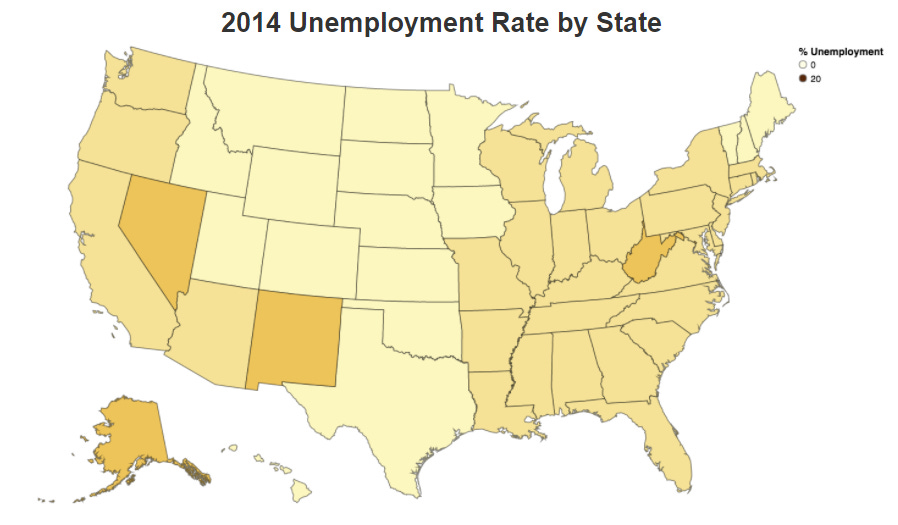
Here is unemployment by state, by Andrew Schoen:
Already one can start to see the “problem” states and regions beginning to stand out. We see in general that the unemployment isn’t all that lumpy, with the eastern US mostly around 6%, and the western non-coastal states closer to 4.5%2. If I were a policy maker, I would be asking what’s going on with West Virginia, Nevada, and New Mexico. How could we help those areas?
Still, the sources of worse unemployment don’t seem very obvious from this vantage point, even though it contain 50 times more granular data than the previous graph.
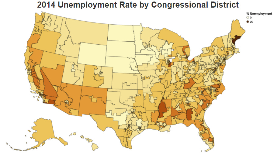
Here is the 2014 Unemployment data by congressional district (note that in low-population states, there are fewer and much larger districts).
Well now we’re starting to get somewhere. We can start to see that the unemployment situation is indeed MUCH more lumpy than we thought. Why is western Alabama so bad compared to Arkansas? Why is Raleigh, North Carolina so much better off than the district just to its north? Florida looks almost like a random number generator, but with a bit of insight you can see a pretty clear distinction between urban centers and agrarian areas in Florida, unemployment-wise. And that’s also reflected in the more heavily farmed parts of California. Hey, what’s wrong with Augusta, Maine?
If a President or a Congress were to look at this map — this field of data — instead of the overall 5.6% unemployment rate, I am pretty sure they would be led to support much different and more effective unemployment mitigation strategies (in a perfect world where such things weren’t actually controlled by perceived ideological stumbling blocks).
There is one more level of granularity Alan looked at: the county level3.
Now we can see that unemployment is not just lumpy, but centered on certain urban centers in many cases. One poorly-run city can bring down a whole state, and a handful of poorly-run large metropolitan areas can hold a huge proportion of unemployed folks in the entire nation.
Again, the policy choices become much more clear when we look at fields of data instead of overall scalar numbers.
The sad part is, a lot of the data that is collected is already tagged geographically, or by race, or by income level, or by housing status. But when we average all of that together in order to get that one number — 5.6%, we lose 99.99% of the information we need to solve the problem.
We turn Big Data into Dumb Data.
The Congressional Budget Office is responsible for running economic simulations on the potential impacts of proposed legislation. This is where we typically get our numbers for statements in State of the Union speeches, like “that bill of mine in Congress right now will lower unemployment by over a full percentage point.”
But we should mostly reject these kinds of statements4. We need to press our leaders and ourselves to dive into the causes and impacts that come from studying the data in its true, full, rich forms.
But how can we do that? I certainly don’t have time to go through county-by-county tax impact statements.
This is where Big Data5 comes in. Using algorithms that we use to assess jet engines, we can also simulate the impacts of raising the Fed Rate 0.5%, or passing a new tax law that increases dependent deductions, or by giving urban parents more school choice. And we can show how that will impact things on a county-by-county level, so we can see if we are going to make a change that matters.
Planning an economy is almost always a fruitless, impossible measure that backfires. But small changes to the economic playing field can vastly improve the lives of millions of people, especially by reducing intrusive and wrong-headed policies based on bad assumptions and bad data.
Imagine applying this Big Data principle to tackling poverty, small business success rates, childhood hunger, literacy rates, or crime prevention. At every level we can marshal resources and fine-tune policies in ways that are ten times more effective than they are now. We already have the algorithms needed to parse, visualize, and process this data extremely well. We just mostly don’t bother.

Almost all the data the government uses and the media report is basically useless. But with modern algorithms and visualizations, we can move into the 21st century of governance.
The fields are ripe for harvest.
<record scratch>
But wait. Most of us aren’t running governments. What does looking at data fields instead of data scalars do for us?
The Data Zoom Process
The Media, Politicians, and Social Media influencers use scalar data all the time to propagandize us to believe one thing or another. And to be fair, we use sparse and averaged data to convince ourselves of our preferred narratives all the time as well.
Learning to intelligently zoom in and out of fields of data in one or two dimensions is an incredibly powerful tool in apprehending actual reality. It helps us escape the false narratives someone else wants you to believe (or that you would prefer to believe). Here is the process:
1) Figure out the important, primary dimensions of the data. By this, I mean are we looking at sea level rise over time (amplitude vs time)? Rate of assaults per local district in our city (rate vs 2D spatial extension)? Vehicle passenger deaths by car model (rate vs type)?
2) Look for confounding secondary dimensions. By “confounding,” I mean this: what other thing can change that will change the overall sense or values of the data? For instance, if you are looking at sea level rise over time near the Bay of Fundy (known for huge tides), will you get similar time-averaged data if you also measure in West Palm Beach, Florida or Portland, Oregon? Adding the dimension of geography can alter the impacts of the time series data. Or if you are looking at assaults per local district, that is a spatial relationship. But what happens if we look at that data over multiple years, or even decades? Was 2020 a particularly bad year in your area for assaults because of unusual and widespread unrest? What if you look in 2018 and 2015? Maybe if you look at Escalade passenger deaths before and after 2014 you will see a big difference because Cadillac added a stronger roll cage and more forgiving crumple zone.

3) Choose wise min and max dimensions to view. We need to use common sense here. It makes no sense to look at data at scales that are irrelevant for what we care about. It is VERY common for people to be fooled by rates of change that are figured out based on dumb scale choices. We do not want to try to figure out sea level rise by looking at sea level changes on the second-by-second timeframe, because of waves. We also don’t want to look based on hour-by-hour timeframes, because of tides. So our minimum timeframe is likely something like a day or a week in timeframe. And even then, we need to make sure we are taking the average over each whole day because of the tides. A good maximum would probably be a thousand years. Going back 10,000 years or more brings in hundreds of feet in sea level change due to Ice Ages.
In looking at assaults, we don’t want to look house-by-house, because each family dynamic is quite different, and won’t directly affect us (unless they are our immediate neighbors, I suppose. So if your neighbor keeps murdering people, you may want to move). A good min scale might be by local district or neighborhood. On the maximum side, it probably does little good to look at violent crimes on the state-wide level, because you are just looking at scalars with all the useful stuff averaged out.
For the vehicle thing, you probably don’t need to zoom in to VIN numbers or even specific factories of origin of exact same models because the design is the same between factories and across multiple cars of the same model. But you also shouldn’t zoom out to country of origin of a car.
4) Now move across the data visually across dimensions and between min and max bounds. Important correlations6 will likely leap out at you. Or perhaps the correlations you expected simply won’t materialize. That lack is also very important data in itself.
By analyzing the richness of FIELDS of data rather than single SCALAR data points, you will have taken a huge step in freeing yourself from propaganda, understanding your world better, and making useful, wise decisions.
Bonus Step: If you can do all those four steps with as little preconceived bias as possible and you stay self-aware during it, you can make important realizations from the meta-data:
If the tides raise and lower the sea level by 1 foot up and down twice every day, then 1 foot of sea level rise in 60 years probably will not cause millions of deaths7.
Exposure to violent crime in most areas is more about the social situations you put yourself in than the geography you find yourself in.
Almost all cars are WAY safer than they were even just 10 years ago.
Just remember, averaging everything together to give simple scalar numbers almost always washes away 99% of the useful information.
The Richer The Data, The Richer Your Mind.
The best place to start when looking for economics statistics is FRED by the St. Louis Federal Reserve Bank. And sure enough it has the unemployment statistic. The key here is that the FRED is just an aggregator of data. But it does link to the original datasets. Which in this case is the U.S. Bureau of Labor Statistics. The specific dataset is the Employment Situation.
To be clear the Congressional Budget Office (CBO) uses sophisticated economic modeling, but the results are often scalars like lowering unemployment by a percentage point. If that bill just lowered unemployment in areas with already low unemployment and made even lower, then this 1% average unemployment lowering is worse than useless. Just as we need to look at the full lumpiness of the problem so to do when need to look at the effects,of the proposed solution.
Big data is just that big. There is nothing particularly special about big data except the pure amount of its can get give us a richness that we haven’t previously been able to achieve. For examples researchers have used cellphone location data to track how movement has changed in the face of COVID-19. Not only can it tell simple things like increase or decrease in movement but the quality of the movement how risky it is. For example a team at USF’s Muma College of Business has been using the data to predict hospitalizations by tracking the number of unique places people go and the density of congregation of people.
Causation doesn’t ALWAYS follow correlation, but it usually does. This is how all of science works, looking at correlations and carefully inferring causation. People dismissing correlations because “Correlation doesn’t mean Causation” is one of my deepest pet peeves.
However, ocean acidification (due to anthropogenic global warming) and its effects on coral reefs and diatoms are quite likely to have profound, severe, centuries-long impacts on the planet’s biosphere.


